Author Archives: tillbortels

CSS Hyphenation – Word Division by Syllable with ‘hyphens’

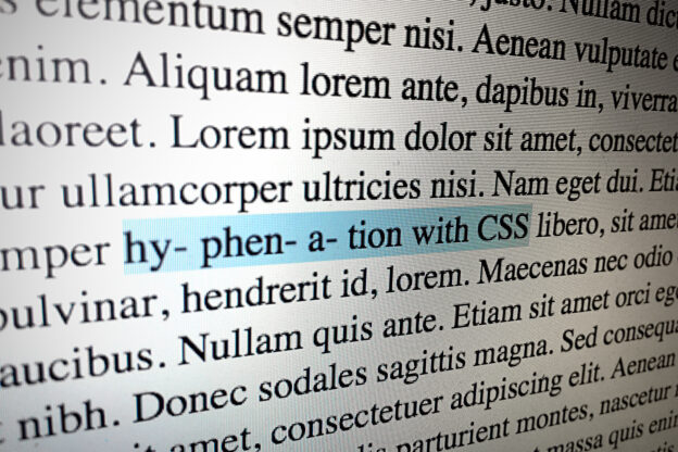
Hyphenation with css – Word Division by Syllable with hyphens

Web design is still a totally different thing than book or print design. The options to actually controll the look and feel are still quite limit, to say the least. But slowly online typography is becoming more and more interesting, more and more options are available. Browsers are able to display webfonts and css offers a few options to actually style the text: relative font sizes (em / rem), line-height, and kerning (letter-space) are just a few of the options that are used in everyday webdesign.

In the recent past it was still difficult to control how text or lines of text would break. One could just stand and watch what would happen when the lorem ipsum was replaced by actual content. Often clients, designers and developers were not really happy about the result: long words would jump to the next line and leave white space behind, making the layout uneven and ‘ugly’. And it was only rarely an option to use ‘justify’ since that would leave ‘rivers’ of white space behind.

Finally we have some options to make text break. The css property hyphens won’t allow you to determine where exactly to break the text, but it would at least enable hyphenation in many current browsers. This is a step forward, towards better typography online – and I’m glad we have it today. In the following code I’ll show you how I currently use the hyphens property to beautify texts:

p {
-webkit-hyphens: auto;
   -moz-hyphens: auto;
        hyphens: auto;
-webkit-hyphenate-limit-lines: 2;
        hyphenate-limit-lines: 2;
-webkit-hyphenate-limit-chars: auto 3;
        hyphenate-limit-chars: auto 3;
}

The hyphens property is set to auto. This means web browsers that do support hyphens will actively divide words by syllable, wherever it suits ‘best’.

The following property hyphenate-limit-lines is set to 2 – this means there should be a maximum of two lines of text that do break a word in a row. By default hyphens would break every word, eventually producing rows of text that end with a hyphen. Having too many hyphens can again make the overall appearance of the text look ugly. So I prefer to limit the number of lines.

The css property hyphenate-limit-chars takes care of the length of the words that are allowed to be broken. The first number is set to auto, which means that words of any length may be broken. The second number determines how long the part of the word before and after the break have to be. Setting it to three will avoid series of word with only two letters being cut off.  That would be un-wanted, un-attractive, un-cool.

Using CSS hyphenation you’ll have to rely on the browser. And the browser again needs to know, with what language it is dealing and what grammatical rules (or actually what vocabulary) to apply. So you’ll have to let the browser know, in what language you text is written:

<html lang="de" dir="ltr"

The above code should be located in the leading html-tag of your html document. In this case it tells the browser, that the text is written in German language (and that it treads from left to right).

CSS Hyphenation in WordPress Themes

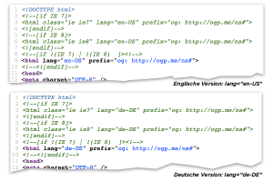
Wordpress CSS-Hyphenation languageUsing a WordPress theme chances are that is has CSS hyphenation already built in. You should however check if your WordPress installation is set to the right language, so that the browser knows what to expect and how to break words.

If CSS hyphenation does not work or works strangely only with very few words, you’ll probably have to set the language of your WordPress installation to the language of your content. You can check what language is set by looking at the source code of your website as it is shown in the picture above. Changing the language of a WordPress installation is not really complicated – here is a quick guide on how to set the language to a different language without doing a fresh install.

browser support for CSS Hyphenation

Currently browser support is good, but not really really good. While Internet Explorer > 10 does actually support hyphens, Chrome does not. Already in 2011 David Newton has written a guide on how to apply hyphenation with a JavaScript workaround. I won’t go that way, since I hope for better CSS support in the future – but in case you can’t afford to wait here is the article:

See also:

manage Textarea resize options with CSS

Usually a textarea (inside an HTML form) is resizable – and that’s a good thing. But often that is just bit too much and a resizable textarea is likely to screw with your precious design. So every now and then you would probably want to control, in what way a textarea can be resized – or maybe you want to turn off the resize-option altogether. With CSS that is easily possible:

disable all resize-options:

textarea { resize: none; }

only vertical resize possible:

textarea { resize:vertical ; }

only horizontal resize possible:

textarea { resize:horizontal; } 

disable vertical resize but keep horizontal resize with a minimum and maximum width limit:

textarea { resize:horizontal; max-width:480px; min-width:240px; }

disable horizontal resize but keep vertical resize with a minimum and maximum height limit:

textarea { resize:vertical; max-height:480px; min-height:240px; )

Test: WordPress / GD Library rendering transparency of PNG images

The following is just a test to see if my WordPress installation / Web Server setup / PHP Version / GD Library are actually rendering transparent PNG images correctly (both 8 bit and 24 bit) or if the transparency gets lost.

And the test result is: yes they do render correctly – transparency is preserved:

#1 8-bit PNG

this is a gray box with a transparent 8-bit PNG inside:
transparency-8-bit-png


#2 24-bit PNG

this is another gray box with a transparent 24-bit PNG inside:
transparency-24-bit-png

Change WordPress language (without re-installing WP)

So, you have just installed WordPress successfully – and now you realize that you would want to run WP in a different language? You basically want to change the WordPress language after install – without re-installing it? Great. I know the feeling.

WordPress is available in many different languages – as far as I know over 70 language packs are currently available – and of course there is also for example a German version of WordPress. So basically you could just download the version in the language you prefer and install it as it is. But that’s not what this article is about.

I recently need to change one WordPress installation to German language. There are many guides, tutorials and how-to’s available that describe how to change the language – or I would actually rather prefer to say they ‘claim’ to describe how to change the language. What most of the guides actually describe is how to do a complete a WordPress installation in a different language.

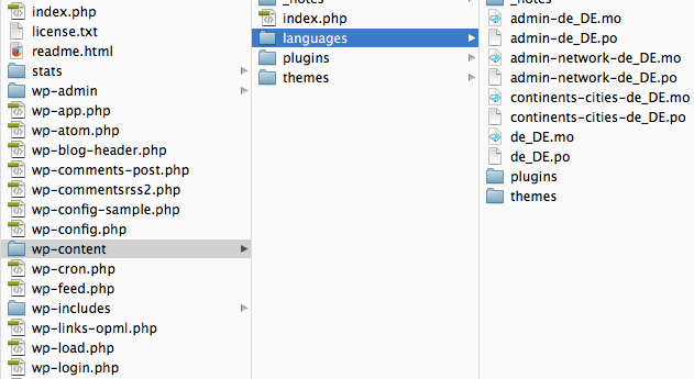
But sometimes you just want to change the language or add another language, without actually installing WordPress. And of course that is very well possible. All you basically will need are the corresponding language files that are usually located inside the folder languages under wp-content. When you do a standard installation these files are however most likely missing.

WordPress German Language Version

WordPress German Language Version

Basically you have two options. Either you download the ‘localized’ installer – there is for example a German installer available right here “WordPress in deutscher Sprache“ > http://wpde.org/download/. You can then find the language files inside the languages directory.

Or you download  the language files you need directly and put them inside the folder languages manually. You can find a directory of various languages / language files  over here: http://svn.automattic.com/wordpress-i18n/

wordpress change languageAfter uploading the language files you can choose the language from the options page in WordPress administration section as shown in the screenshot. Previously you first had to edit wp-config.php – with newer WordPress versions that is no longer necessary. You may however still find this note: „Note: The WPLANG constant in your wp-config.php file is no longer needed.“

Centered Layout jumps for Scrollbar [CSS solution]

The following scenario might sound quite familiar to the one or the other web designer / web developer: you have a nicely centered layout, but of course some pages have less content than others. For example the contact page can be quite short, if it only features a contact form and some contact details.

So – basically everything is in shape, the layout behaves well – web design by the pixel – only one or two pages don’t have a scrollbar, all the others do. Basically this would not be that dramatic – most browsers will not bother about the little difference and instead display all pages equal. But some browsers don’t. Instead the centered layout is positioned a few pixels to the right, if the scrollbar is missing – or the other way round: the layout ‘jumps’ a fex pixels to the left, if the current page has a scrollbar.

There is a simple scc-trick to solve this problem of ‘jumping’ centered layouts. You just have to force the browser to provide the space for a scrollbar – whether there is a scrollbar or not. Here is the corresponding css-code:

html {
    overflow-y: scroll;
}

Just put the above css snippet in your stylesheet and you’re basically safe. However the above code is actually not really valid css, but who cares anyways. It does solve the problem – and it’s compatible with most modern browsers. According to css-tricks.com only older versions of Opera are not cooperating.

WordPress: jacking up the sub-menu and styling it

You probably very well know the sub-menu that is “flying-out” from the main navigation on hover.  Many free WordPress Themes are equipped with that rollover-sub-menu and while it may be a nice thing to have, sometimes you want to style it in peace and quiet. And that can be difficult, since it is usually hidden and only shown on rollover (hover) – so working on the sub-menu can be a bit demanding, to say he least.

The right-mouse-button-trick can be handy, to at least check which part of the Style Sheet is doing what: right-clicking on one of the sub-menu’s elements makes the sub-menu stay – and you have virtually all the time in the world to explore the different style instructions put upon it. But after the next reload the sub-menu will be hidden again – and you’ll start all over again: hover, right-click, explore…

So sometimes you may want to really disable the hover, or whatever / who-ever is triggering the sub-menu to show and hide, so you can work on the design details without the actual rollover-effect in action. I was basically looking for a way to have the sub-menu jacked up like a car so I could crawl underneath it and really check out all the css style and design details. This could really speed the development progress up a bit – I hoped.

I just spent some time (actually too much time!) checking out where the actual css ‘command’ is situated, that makes the sub-menu disappear – and re-appear on rollover. First I looked for something like display: none or visibility: hidden but that didn’t lead anywhere. Finally I found it – and maybe this little piece of information is also valuable for somebody else – so I’ll better share it right here / right now, so that also other WordPress–Developers may jack up the sub-menu and crawl under it.

The style sheet of the WordPress-Theme Twenty Twelve has an area for screens wider than  > 600px – there are some style ‘commands’ referring to the unordered second level list that makes the sub-menu:

.main-navigation li ul {
        margin: 0;
        padding: 0;
        position: absolute;
        top: 100%;
        z-index: 1;
        height: 1px;
        width: 1px;
        overflow: hidden;
        clip: rect(1px, 1px, 1px, 1px);
    }

This above style information shrinks the sub-menu-container (ul) to 1×1 pixel – and the overflow: hidden; hides everything, that would otherwise be visible outside that 1×1-pixel-container.

A few lines further down this style instruction is then abolished and the sub-menu becomes visible:

    .main-navigation ul li:hover > ul,
    .main-navigation ul li:focus > ul,
    .main-navigation .focus > ul {
        border-left: 0;
        clip: inherit;
        overflow: inherit;
        height: inherit;
        width: inherit;
    }

By simply commenting-out the first style information about height, width and overfow, the default state will be the ‘hover state’ so you can see the sub-menu all the time, without hovering the main menu:

.main-navigation li ul {
        margin: 0;
        padding: 0;
        position: absolute;
        top: 100%;
        z-index: 1;
       /* height: 1px;
        width: 1px;
        overflow: hidden;
        clip: rect(1px, 1px, 1px, 1px); */
    }

So… Now you know how to jack up the sub-menu, crawl under it and do some styling in peace and quiet.

rMBP HDMI to TV: Crazy Color Problem [solved]

MacBook Pro HDMI TV crazy colors

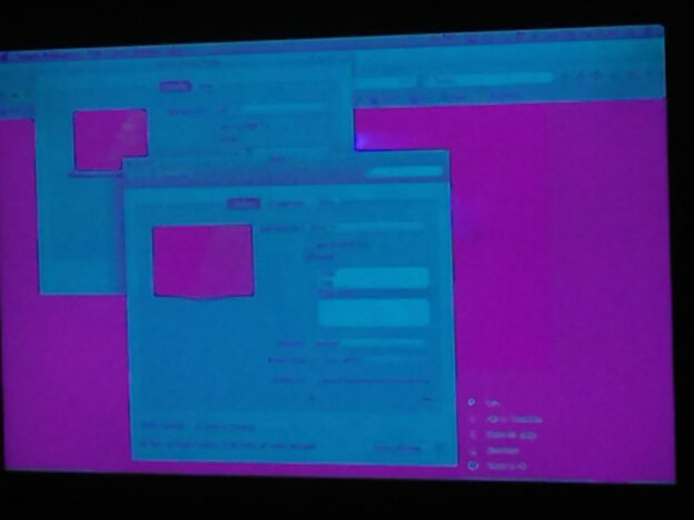
MacBook Pro connected to TV via HDMI shows 'crazy colors' - Photo/Screenshot: T.Bortels/cpu20

For a couple of years we had an iMac connected to our SONY Bravia TV via a HDMI cable, so we could watch DVDs and YouTube videos on the TV. Now we finally wanted to first time connect the rather new MacBook Pro to the TV – and were confronted with some nice looking problem: the colors went crazy.

Connecting the Retina 15″ MacBook Pro to the SONY Bravia via HDMI cable was easy. The rMBP has it’s own HDMI port – so all the adapters I was used to use with the iMac suddenly weren’t needed anymore: plug’n’play HDMI fun. So the video signal found it’s way to the TV – but on the TV screen everything appeared in ‘crazy colors’. It looked as if the black and white tones were replaced by magenta / pink / purple and baby blue. Wow! How psychedelic! As if the TV now had a built in solarization filter

The internet seems to be full with suggestions what could help to solve this problem: from changing cables to color calibrating. But nothing of that helped to solve the problem. For us the solution was rather simple: the retina resolution of the MacBook Pro seems to be the ‘problem’ – providing a ‘wrong’ resolution to the TV set.

To solve this problem we did the following:

  • open the system preferences and go to
    > display
  • Then simply switch the resolution from 1360 x 768 to 1080i
  • optional: splitting the displays (uncheck “mirror displays”)

After that the crazyness was over and the colors shown on the TV set were behaving normal.

Manage display of WordPress Widgets (e.g. not on front page)

With the so called Widgets a lot of information can be displayed in the sidebar of a WordPress website. Sometimes this can be a little bit too much information and you want to cut the number of widgets displayed. Two plugins can come in handy.

The problem is actually not a problem at all: a default install of WordPress offers a lot of widgets, that can be implemented easily and display a lot of information automatically:

  • latest blog entires
  • latest comments
  • a Tag-Cloud with popular keywords / tags
  • search
  • links to social media profiles
  • links to neighboring websites (Blogroll)
  • Shop-Categories
  • most popular posts
  • etc.

Sooner or later the sidebar might get jammed, overstuffed with widgets, the user doesn’t recognize any of the precious widgets and the User Experience goes down the drain.

This doesn’t have to mean that you should turn off any of the widgets you installed over the time. Instead you should focus – and see what widgets make sense on what page.

Widget-organization meets information Architecture

So sooner or later you should have a look at you collection of widgets and make a plan ,which widget you would want to present in which context / on which page / on which content  type. What is the most useful additional piece of information you want to present on that particular page? You’ll need to define a logic behind the display of widgets.

manage wordpress widget display by pathGood news is: there is a rather simple solution to handle such logic: the plugin Widget Logic is light weight and rather easy to handle – maybe a bit too easy to handle. With a few lines of PHP you can define almost every condition you like. And this can be a security risk since everybody with access to the widget administration can inject virtually any type of malicious code.

Here come another plugin  handy: the plugin Widget Logic by Path reduces the power of Widget Logic to paths – and in most cases this will probably be exactlty what you would want.

For example: entering the short code <all paths except> will make the widget not show on the pages / paths listed below that short code. Adding <home> will make the widget not show on the front page.

Here’s the links to the above mentioned plugins with additional information:

10 steps to boost your Blog-Income by factor x-1000

It was last weekend that I found it was too hot to work – but still I wanted to do something at least work related. So I wrote this article, that I always wanted to write, on how to boost your blog-income… a thousandfold… theoretically.

First things first: this article is half ironic – but I have no doubts you may still find a lot of useful information, on how to improve your blog-income: attract additional readers, generate additional page views, raise the click-rate and raise the money that you get per click. And there are also some other probably useful truths in the following text that might be useful for someone how is cosidering to earn money online by blogging.

So maybe you’re running a website and/or a blog? Or you have thought about starting a blog to generate an additional passive income stream? Or you just want to ‘earn money online? I have to admit I do – but most of my income I make ‘online’ does not come from ads or affiliate programs. But that’s a different story.

I you want to earn some money ‘online’ there are a number of options. Monetizing a blog by putting up ads and affiliate programs is one of them. Maybe it’s not the most lucrative method, but chances are that with a decent amount of visitors and the right niche you can actually earn some money writing blog articles.

monthly income = monthly clicks x reward per click

So to increase you monthly blog-income, you would basically ‘just’ have to increase the number of monthly visitors and/or raise the reward you’re paid per click.

How can I raise my blog-income by a thousandfold?

The answer to that question lies in the power of the number 2! We simply try to doubling the income with each of the following ten steps and as a consequence the income stream should  increase by the factor thousand. Or actually by the factor 1024 to be exact. Unrealistic? Maybe. But as I mentioned before: there are some truths on the way that may help you anyways.

For this example we will assume you have a blog already, you have a devent amout of content and you make already 1 Euro a day (or 1 dollar if that’s your currency). Let’s go…

1. Search engine optimization (SEO) = more visitors

Try to double the number of visitors by optimizing your website to be ‘more attractive’ to search engines. Today this basically means: make your content mire attractive to humans – and the search bots will be pleased. Check your content: improve your texts, add valuable information, add images, add infographics. Structure your articles. Add sub-headlines. Add descriptive alt-tags and captions to images.

Chances are, you can double the number of visitors by optimizing and improving the  content you already have. Doubling the number of visitors means doubling the number of clicks – and theoretically we just doubled the blog-income to 2 Euro per day.

2. Higher reward per click by optimized context

Some keywords pay better off than others. Do some basic research on the value of your context. Find neighboring topics or related keywords that can attract higher paying ads. The CPC in google adsense / google adwords tells you, how much money you’re paid on average per click (“cost per click”).

By working on the context we can theoretically double the average CPC of your blog. And doubling the CPC means doubling the monthly blog-income – so we have theoretically just doubled the blog-income to 4 Euros per day.

3. More visitors by writing in an additional language

Do you speak a second language? Brilliant! You can theoretically double the number visitors by ‘simply’ providing your content in a second language – so we have just theoretically just doubled the blog-income to 8 Euros per day by translating existing content into a second language.

4. Double your blog-income by writing a second blog

This is a tricky one: close to your main subject there may be a second field, that has similar readers. You can try to start a second blog about another subject you feel comfortable writing about. See if you can attract the same amount of readers and/or income there – and you can  theoretically  doubled your blog-income to 16 Euros per day.

5. More visitors through incoming links

I won’t call this link building, but basically it is link building. But in the recent weeks / months there has been a lot discussions about the usefulness vs. uselessness of link building. True: it can probably harm your search engine ranking, if you overdo it. But ‘truthful’ link building will never hurt anybody.

So do some research in your field and mention neighboring websites and/or blogs that you like. And don’t hesitate to inform the webmasters of those websites that you are linking to them. Chances are, they will link back.

Another approach to win some incoming links is to write valuable content that people really like. Chances are, that some people will put up links to your website, just because they want to recommend it to their readers. Also in times of ‘link buildings discussions’ this is still comon practice. And incoming links do bring additional visitors – either indirectly through an improved search engine position, or directly – through a click on that link.

‘Link building’ has the potential to double the number of visitors – so we theoretically just doubled the blog-income to 32 Euros per day.

6. Optimize the CTR by optimizing your headines

This is also a classic: in most cases the headline of your article is the first thing somebody sees in the Search Engine Result Pages – and how it is perceived can have a great impact on the decision, if the user clicks on it – or not. So writing good headlines can improve the rate of click-throughs – the click-throuh-rate CTR. And headlines are of course also rated by search engines themselves. So there you have already two good reasons to work on your headlines.

Improve your headlines – and chances are you can double the number of visitors – – so we theoretically just doubled the blog-income to 64 Euros per day.

7. Increase the range of your blog through social media and/or newsletters

Offer ways to subscribe to your content so you can turn one-time visitors into returning visitors. Returning visitors are good visitors for various reasons: they are likely to engage with your blog and/or even spread your content among their own audience by sharing it, writing about it, linking to it.

Add a social media profile for different social media platforms: twitter, facebook, instagram, google+. Use any of the many available newsletter tools – and make sure you have a link to a rss-feed.

Making use of rss, social media and newsletters can double the number of visitors– so we theoretically just doubled the blog-income to 128 Euros per day.

8. optimize the position of ads and affiliate programs

Above the fold? Below the fold? Is there a fold? Try for your self. Try different layouts, play around with different positions for your ads and/or affiliate links. Often the right sidebar is overrated by bloggers: it’s just too easy to place an add there – but does it pay? Technically the sidebar is often loaded last – so the add visitors see first may be the last one loaded – which can mean it’s not the most valuable add.

Optimizing the positioning of ads can double the click rate and/or the pay-per-click – so we theoretically just doubled the blog-income to 256 Euros per day.

9. Double the number of articles

Step number nine may be the most difficult to achieve, but at the same the easiest: you double the number of readers by doubling the pace of writing. So instead of writing two articles per week, you write four.

blog-income increaseBut here you should already have become sceptical about the list of ‘improvements’. If you really wanted to follow all above tips and tricks to double your blog-income, you would now have to write double the amount of articles of two different blogs, in two different languages each – and make sure they are double as valuable / double the length. So if you first only spent 2 hours per week writing, you will now find yourself writing 2x2x2x2x2 = 32 hours per week!

However – theoretically it should be possible to double the number of readers – or at least double the number of page impressions by doubling the number of articles written – so we theoretically just doubled the blog-income to 512 Euros per day.

10. … Can you make real money blogging?

We are actually not done with the ten point list – but I guess you got the idea by now and I will leave the tenth point to you.

Yes, there are ways to make real money online – while blogging may be one of them, just writing articles and putting up some ads may not work. There is more making a living than just that. Maybe you can come up with your own idea how earn a decent amount of money by ‘simply’ blogging – and maybe you even manage to double your blog income every now and then? Please feel free to let me know – I’m quite curious…

related reads:
Desaturate pictures with CSS (Grayscale-Color-Hover-Effect)

CSS Hover Effect for pictures: Grayscale Color change

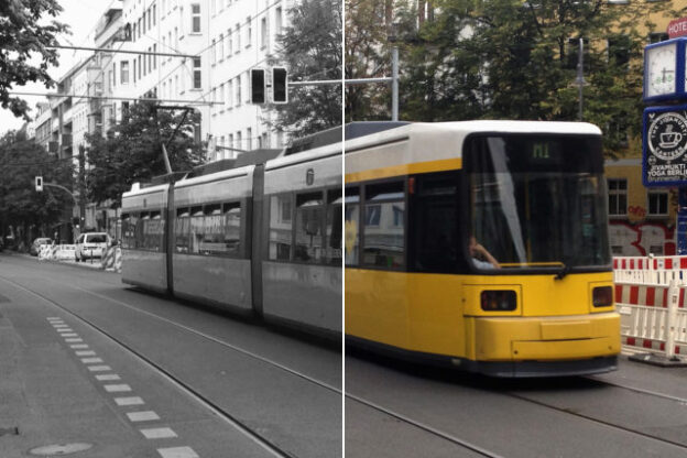
Change between Grayscale and Color image with a nifty CSS hover effect - Photo/montage: T.Bortels/cpu20

Hover effects are sometime overused – but when done right they can be a useful detail, having a positive effect on the webdesign and the overall user experience by simply highlighting clickable images on hover. Here is a short introduction how to implement a Grayscale-Color-Hover-Effect for the images on your website.

Introduction

If you wanted a nice ‘grayscale effect’ (“black and white”) for your images, back in the times before CSS3, you would have to upload two images. You would probably have uploaded the full color version and a grayscale version of the actual image and then changed the image path / URL dynamically with a small JavaScript snippet.

For a long time that was at least my preferred method if I needed such an effect in a website. This JavaScript method basically worked quite well – but it was also a bit unhandy. You would of course first have to actually make that second image – then upload it. You would then basically have doubled the amount of data a user would have to load for viewing each image – additionally the second ‘hover’ images had to be pre-loaded in the background.

Then a rather nifty css trick came along. You would only have one image file but there would be two versions of the image: a full color version and the grayscale version. You would then use the image as a background image, crop it with a container (overflow hidden) and simply move the position on hover. No JavaScript needed, but still not too elegant. The images were basically hidden from search engines – and the image file (sprite) would be at least twice the size of the actual image. Bad for SEO, bad for you.

For smaller images used as navigation elements (e.g. in slideshows) this “sprite trick” is however still popular today. You can for example easily style slideshows (for example ‘out of the box slideshows’ that come with many premium WordPress themes) by simply replacing the sprite. But for larger images like teaser images this technique is not practical and rather not recommended.

CSS3 to the rescue!

Finally CSS3 brings on a solution to this matter. Desaturating pictures with CSS only is much more convenient than using a desaturated version of an image – especially when you are working with editors and/or WordPress- or Drupal based CMS. You don’t need to follow complicated workflows, no JavaScript involved. You basically just need to upload one image  and add a CSS class that will trigger the grayscale effect on hover. This can for example be used to highlight preview pictures / thumbnails on hover like teaser images or the like.

Here is a working example of the effect:

grayscale effect hover picture with css

hover the mouse over the image to get the color back

Of course one could question if using this effect was ‘necessary’ – or if hover effects are useful at all. But I won’t go into that discussion now. For some websites it may make sense to have a hover effect applied to images – and I personally quite like the grayscale effect, if used cautiously. In my opinion the change from grayscale to full-color is more subtle than for example zooming in/out or changing the opacity of a preview thumbnail. This is even more the case, if you decide not to desaturate the images completely and maybe also to add a transition to the hover effect.

half-desaturate picture with full color on hover (pure css)

hover the image to get the color back

The desaturation effect can be achieved using the CSS filter property. Most modern browsers will render filter correctly, however it is (of course) not fully compatible with Internet Explorer – at least not with the recent versions IE-10, IE-11 and also Edge is lacking support. However – older Internet Explorer versions actually do know the filter property but use a different approach than the upcoming CSS3 specification would suggest. Instead of filter: grayscale you can use filter: gray to target IE versions 6–9.

You could however use a small JavaScript snippet to make also newer versions of Internet Explorer desaturate images, but I don’t like that approach and I will not dive into that in this post. I would rather want browser manufacturers support this useful feature. IMHO implementing workarounds to make the grayscale effect work won’t make browser manufacturers move towards this direction. Anyways…

Also Firefox < V.35 does not support filter: grayscale – instead you’ll have to implement a small workaround to address older Firefox versions. But since that’s a rather simple and generally interesting trick I’ll quickly mention the details: you can use an SVG-image to make Firefox 4 – 34 desaturate images. Ok – enough introduction – here the details how to get the css grayscale hover effect working:

Grayscale Hover Effect CSS Code Samples

In the above example, the color images, that shall be displayed in grayscale, are marked with a class named “desaturate”

<img src="/bilder/farbfoto.jpg" class="desaturate thumbnail">

For almost all browsers we can now write a suitable CSS property that will take the color from the image so they are displayed in gray / grayscale:

.desaturate {
    filter: grayscale(100%); /* Standard CSS */
    -webkit-filter: grayscale(100%); /* CSS for Webkit Browsers */
    filter: url(/elements/grayscale.svg#desaturate); /* Firefox 4-34 */
    filter: gray;  /* Internet Explorer IE6-9 */
    -webkit-filter: grayscale(1); /* Old WebKit Browsers */
}

On mouse-over (:hover) we want to display the full color version of the image. So we’ll have to remove the original filter-effects from images – or actually reset them:

.desaturate:hover {
    filter: grayscale(0%);
    filter: none;
    -webkit-filter: grayscale(0); /* Old WebKit */
}

Some details about the SVG image: since SVG-images are not really images, but basically collections of tags and vectors that are described using XML statements, we can easily generate this image by copying the following code into a text file, save it as “grayscale.svg” and upload it to the webserver. Here is the content of that text file:

<svg version="1.1" xmlns="http://www.w3.org/2000/svg">
    <filter id="desaturate">
    <feColorMatrix type="matrix" values="0.3333 0.3333 0.3333 0 0  0.3333 0.3333 0.3333 0 0
0.3333 0.3333 0.3333 0 0 0  0  0  1 0"/>
    </filter>
</svg>

The above SVG uses the feColorMatrix – so the numbers following that tag are part of a matrix that describes the color effect. You can use that matrix to apply all kinds of color effects – I won’t go into details now. If you want to find out more on the feColorMatrix I would recommend the article “Color Filters Can Turn Your Gray Skies Blue” over at css-tricks.com or read the wiki page about feColorMatrix over at docs.webplatform.org. Both articles have quite a number of examples that show how to manipulate images using the feColorMatrix – from Sepia Effect to colorizing. Quite many effects one may know from image processing software like Photoshop are also possible through applying filters.

How to half-desaturate an image with CSS.

For the second example I used a different CSS class ‘half-desaturate‘ and different svg, utilizing the saturate property. In this example I want to have the image half-colored / half-grayscale – the desaturation should be applied to 50%. First the CSS:

.half-desaturate {
    filter: grayscale(50%); /* Standard */
    -webkit-filter: grayscale(50%); /* Webkit */
    filter: url(/elements/half-grayscale.svg#desaturate); /* Firefox 4-34 */
    filter: gray;  /* Internet Explorer IE6-9 */
    -webkit-filter: grayscale(0.5); /* Old WebKit */
}

And this is the related svg file:

<svg version="1.1" xmlns="http://www.w3.org/2000/svg">
    <filter id="desaturate">
      <feColorMatrix in="SourceGraphic" type="saturate" values=".5" result="A"/>
    </filter>
</svg>

…and Bob’s your uncle.

Please feel free to leave a comment below.

You can download the grayscale.svg from here and find the half-grayscale.svg right here. And just to make sure – here is a link to do a quick cross-browser-check over at  Can I Use to see in what browsers the CSS-Filter property is working:
http://caniuse.com/#search=filter